For this project I set out to make improvements to the ODU Library Website, making it easier for users (specifically students) to find various elements like the resources not included in Monarch OneSearch and the actually helpful information relating to Monarch OneSearch and the libraries themselves. The project was created entirely within Figma.
The Problem
The "problem" is that it isn't easy for students to use the library website to it's full potential. At first glance, the website can be confusing, and it's not very intuitive where to look for help. The existing help tab is more about ways to directly contact the library to ask questions rather than providing access to the helpful resources that are already digitally available to users. There's also resources that the library website provides access to beyond Monarch OneSearch and it's not immediately obvious that they are first, separate, and second, readily available. My intial goal therefore, was to make modifications to the library website that address these two most immediate examples, in hopes of improving it for users.Research
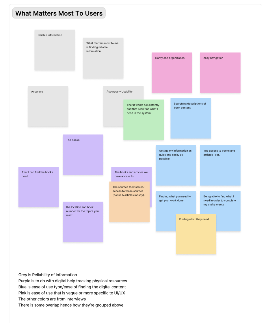
For market research I ended up looking at JSTOR and Databases from the Department of Education. It was helpful to see other "library" and collection/archive websites. Despite it being helpful, it was the user survey feedback that ended up being most relevant and helpful to this project. The primary take away was that navigation issues and lack of visibility for helpful resources resulted in wasted time and extra stress for users. The goal became increase clarity of navigation/intuitive use and organization, and decrease uncertainty in resource use, wasted time, and any residual stress. Clusters, Insights, & Design direction
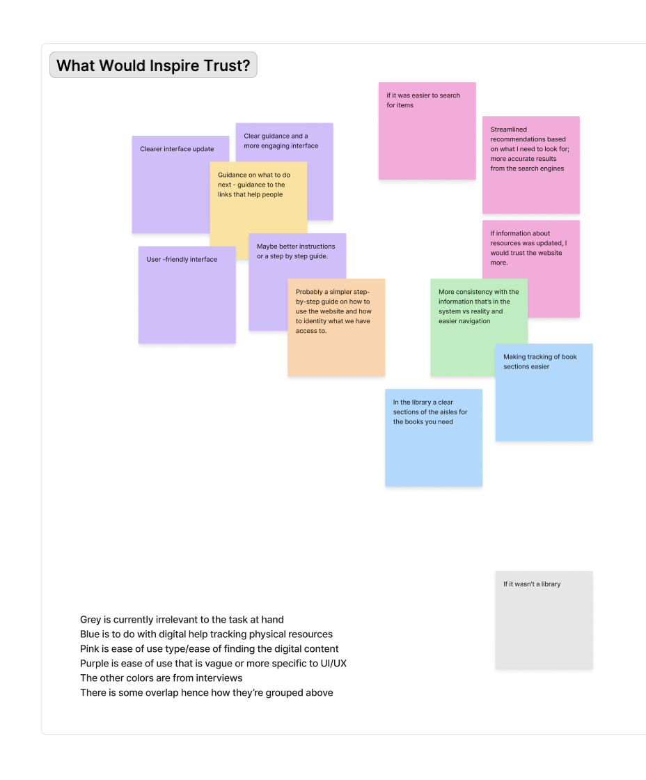
I clustered individual research into groups to organize it all, using those clusters to then make insights that helped guide my design decisions. The insights I gained from the clusters concluded that making the website easier to use and more consistent would inspire more trust in the website and it's use.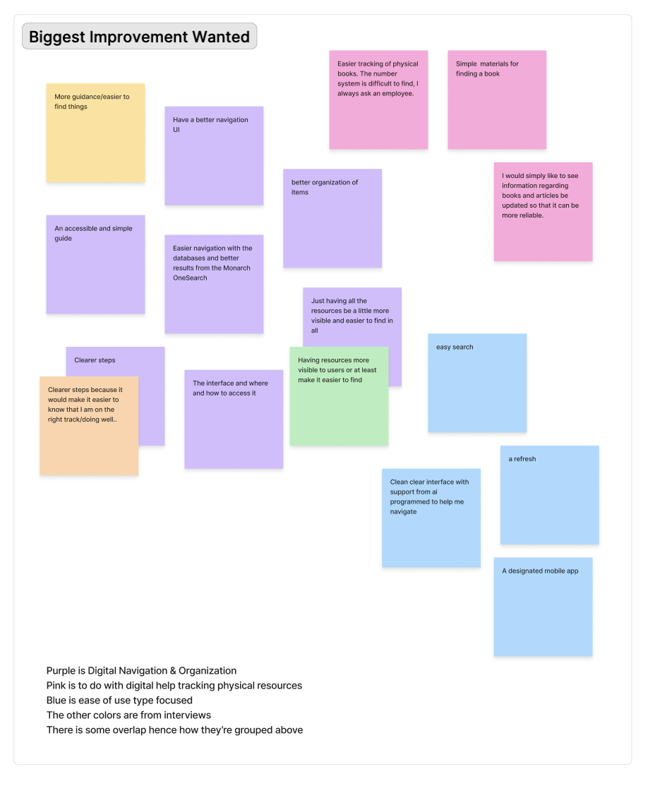
User Persona
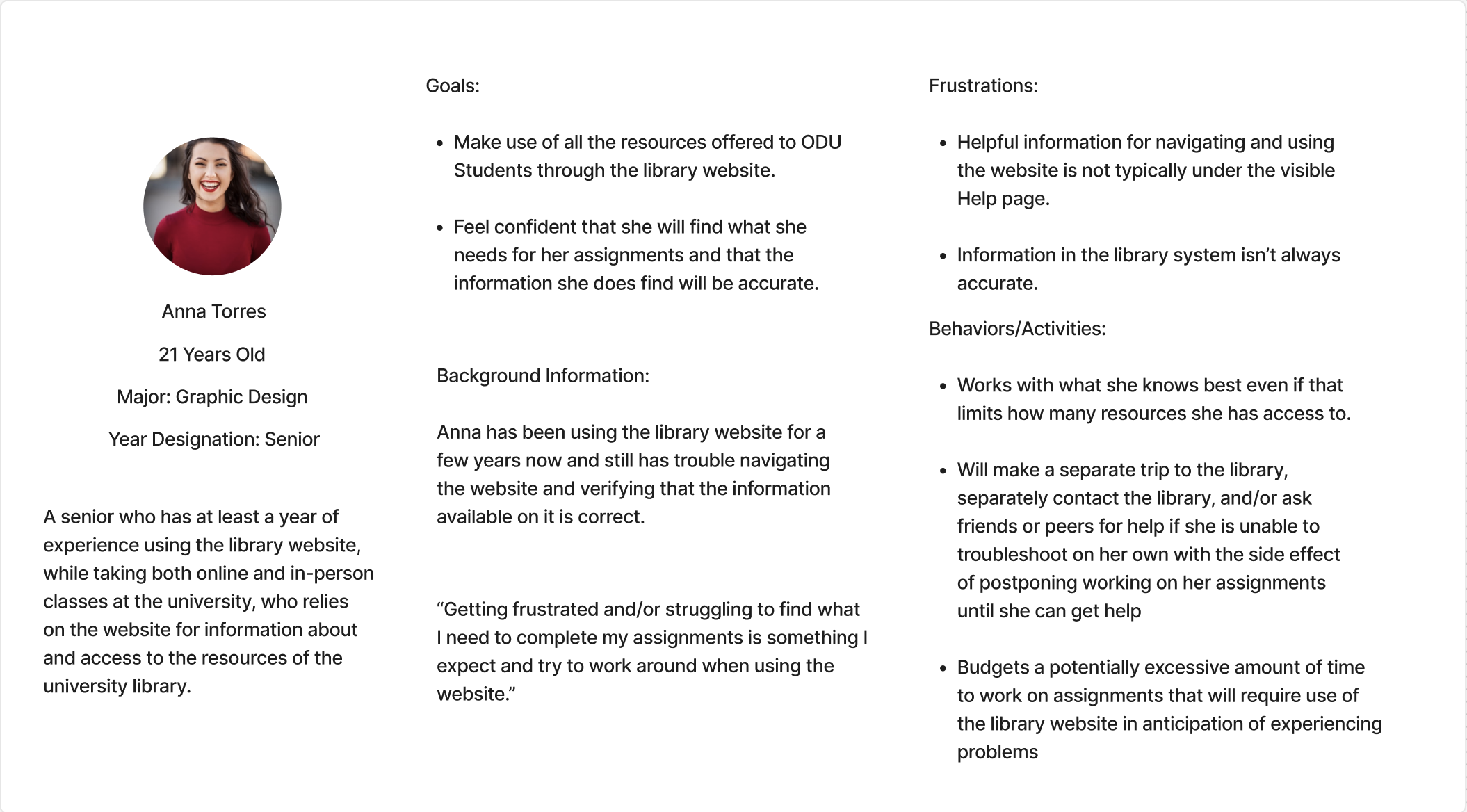
This is the User Persona I was able to come up with:
User Flow
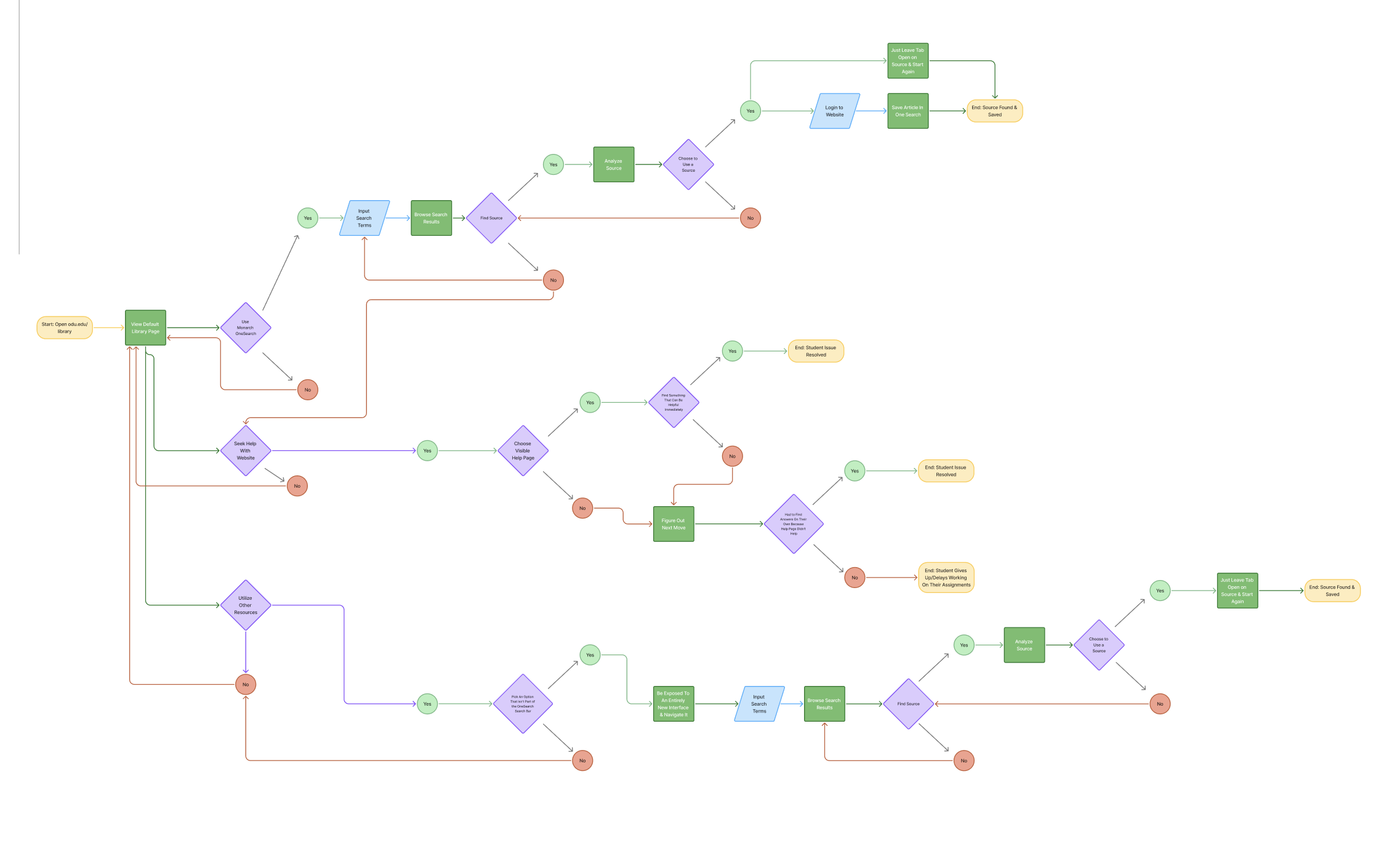
This User Flow establishes successful use of the website, and what course of action would be if unsuccessful.
Design Process
Final Prototype
Reflection
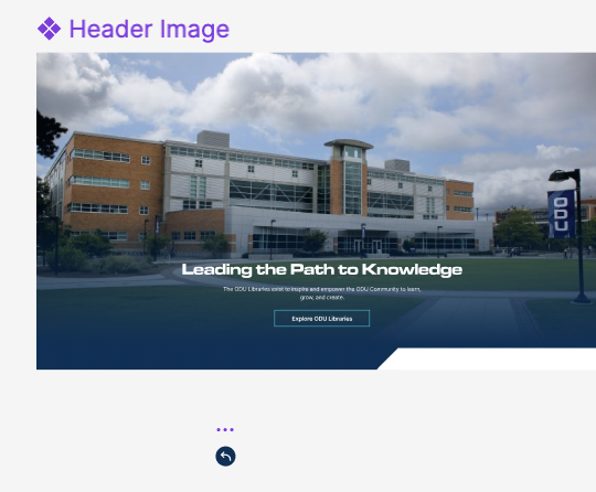
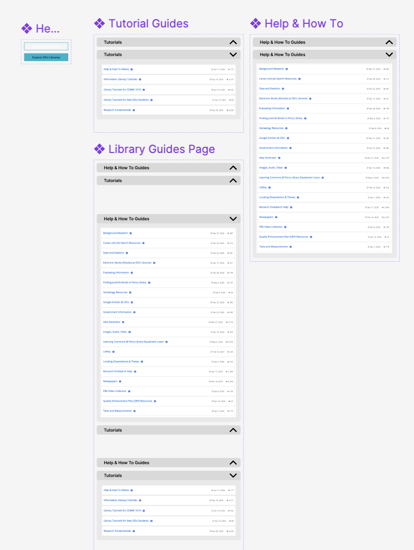
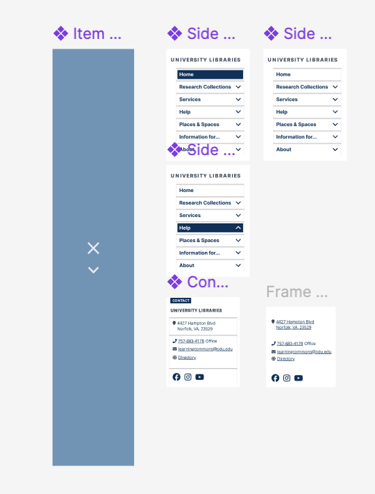
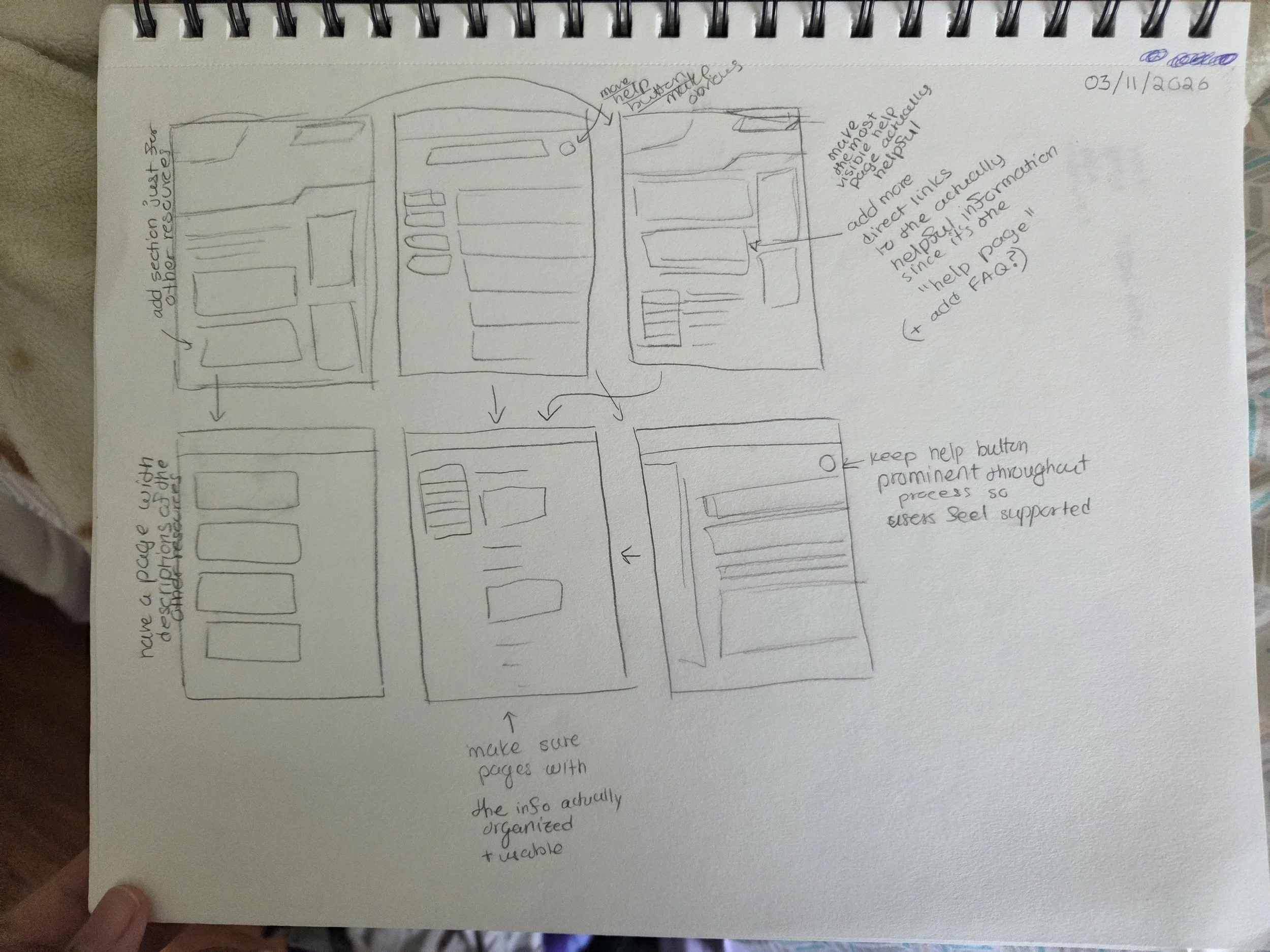
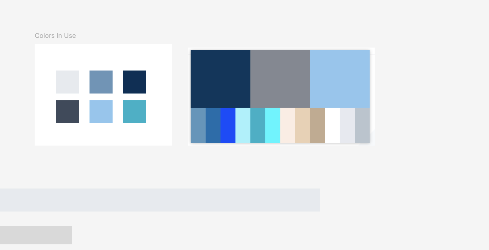
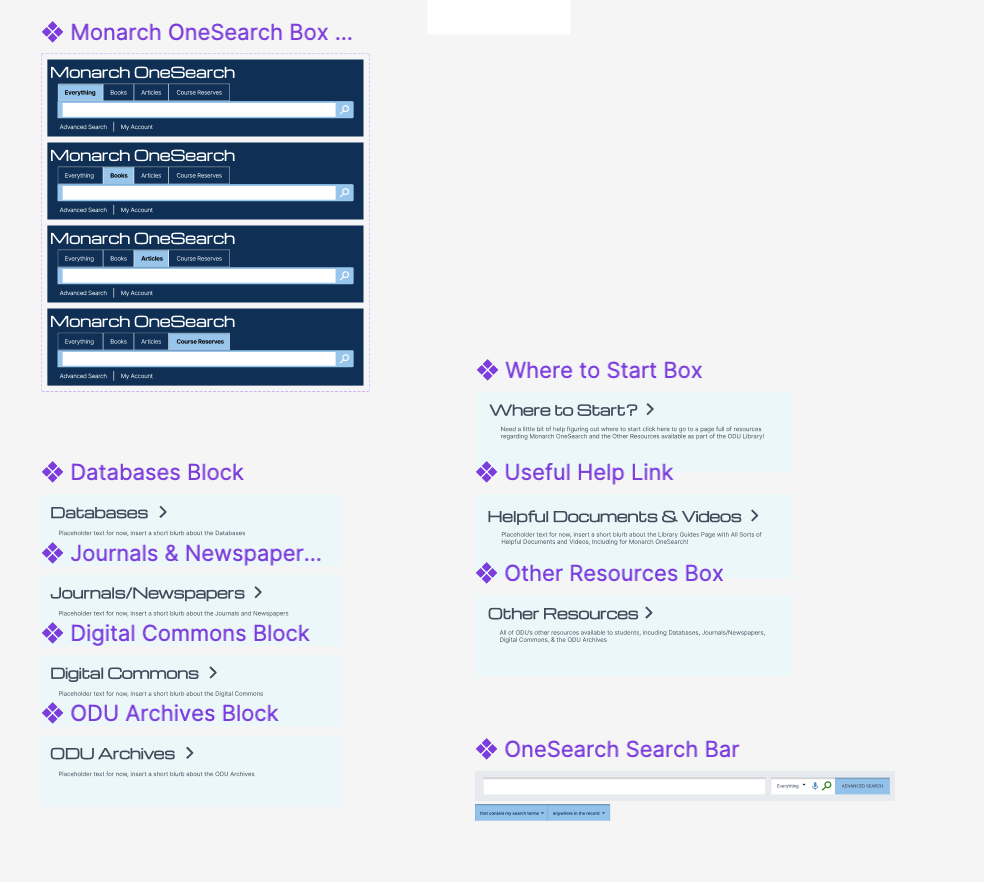
The design process started with examining the current library website layout and making low fidelity sketches to plan my layout. Then I consulted the ODU branding page available on the website, and from there I began to build my components, and then my prototype, in Figma. I did have to go and find other typefaces that weren't on the branding page but that were in use.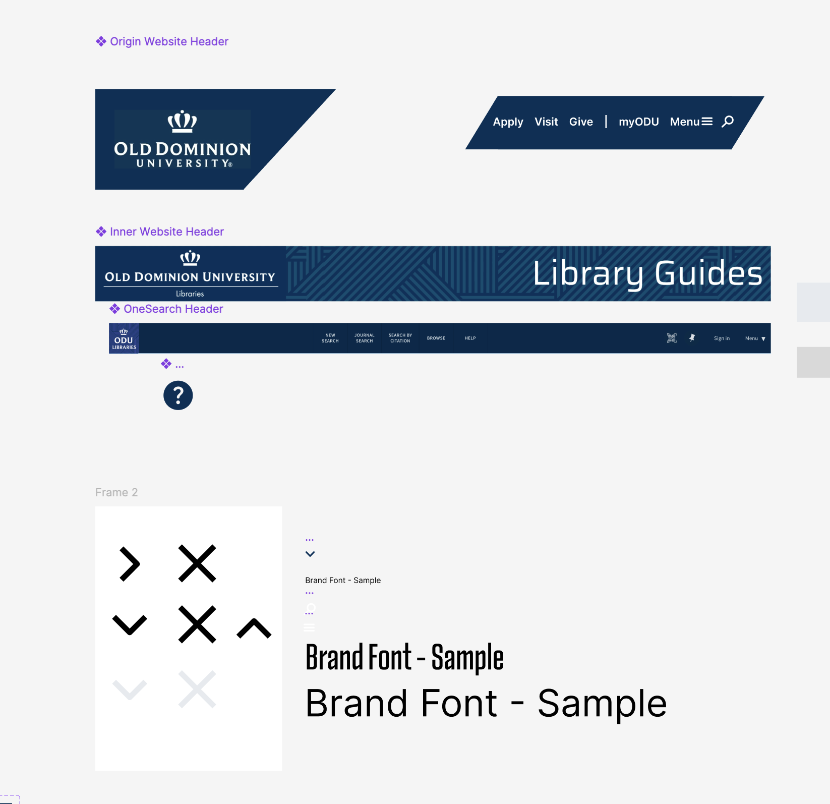
Usability Testing
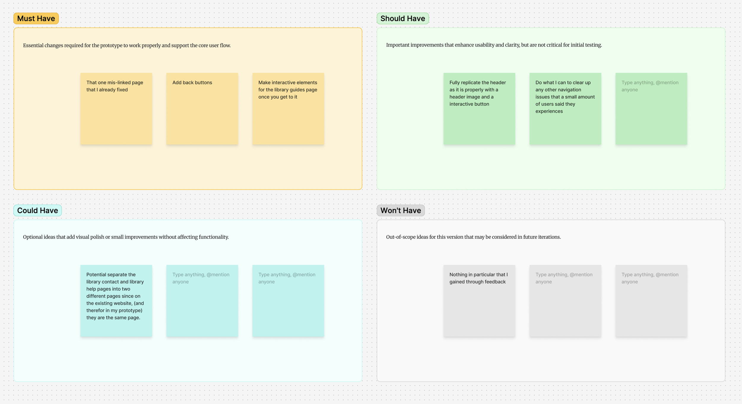
User Testing provided some very useful feedback for the prototype. Several questions asking specifically for navigation, clarity, and any aesthetic choices. A quick fix for a mis-linked page, adding more obvious back buttons for ease of use and clearer navigation within the prototype, and fully recreating the header for some for the main home page and adjacent pages were the main changes I was able to make to improve my prototype.
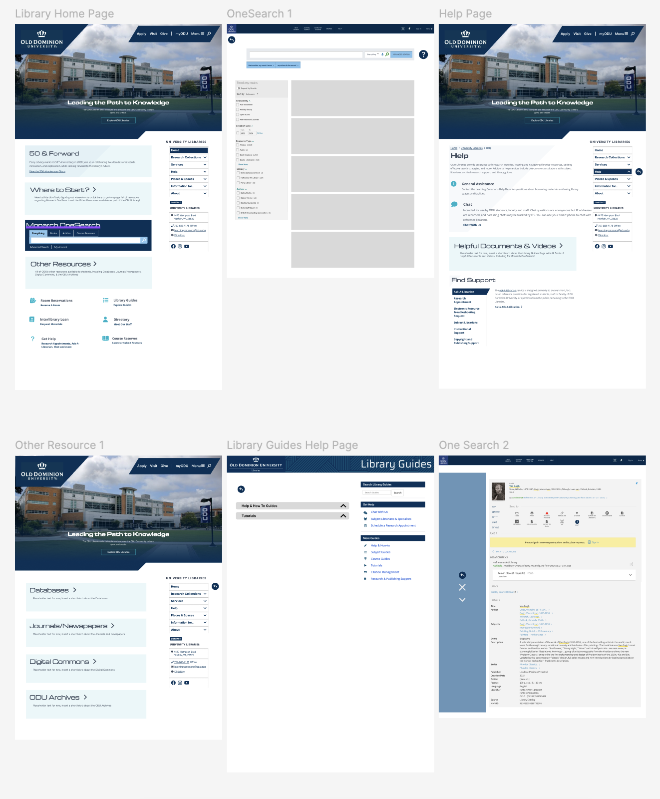
Here is a run through of the final prototype and an image of all of the pages!Overall, I had a lot of fun with the project and I'm happy with how it came out! There was a little bit of workshopping I had to do with the prototype to get it to function how I wanted it to and to have it do that well but I learned a lot and my next steps would be fully expanding on certain areas that didn't get as much attention or potentially a full layout redesign since the existing layout, though modified, is still not perfect.